One thing that will forever be cool and popular are those black and white images where one particular part of the image is still in color. These can be fast and easy to achieve, using the ever powerful Photoshop. Lets see how it is that one can go from color to black and white and then back to color, but only with a single item in the image.
This is the image that I will start todays blog with. It is a single leaf floating in a pond with other leaves below it on the bottom of the pond.
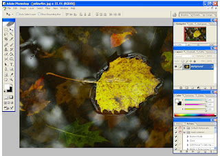
I should take a second and explain something that Vincent Versace explains in one of his tutorials. He tells us that we should start our editing process with the largest over all fix first, and then work our way to the smaller fixes. For example, if we need to color correct, than that should come first. Removing some acne on a face should come later, as we edit. With that said, lets assume that this image above has been color corrected, and every other major edit has been performed already. We only want to get it to a nice looking black and white with only some "color spots".
Drag the background layer (in the layers well) down and drop it on to the "duplicate layer" icon, which is the square in a square icon. This will copy the background layer, and now you should have two layers. Under the "Image" heading on the top of the software screen, select "adjustments", and then choose "hue/saturation". Take the saturation slider and move it all of the way to the left, or to "-100". You should be seeing a black and white image. We are not there yet, but we are close. The image seems to lack some pop, or lack some true black and true whites.
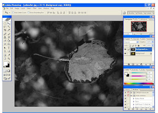
Next we are going to dial in the blacks and the whites. This can be done in a number of different ways. I will show you a couple of different ways to do this, here in this blog entry. The different ways that I will show you are perhaps the two most common. Performing both of these on each image that you edit might be overkill. The idea here is to show you a couple of different ways that you can use with any image that you wish to change to a black and white, and then you can find what works best for you.
The first way that I would like to show you, in order to boost the blacks and the whites, is with the levels tool. Click on, and drag the new black and white layer down to the same "new layer icon" in order to copy it to a new layer. Click on the "Image" heading once again and then choose the "adjust" heading, and then click on "levels".
The pop up screen for the levels slider, or the dialog box, is our black and white images' histogram. Move the left (black) slider to the right until it is just under the first bit of black information in the histogram. Next, slide the right (white) slider to the left, until it is sitting just under the first bit of white information in the histogram. You may now move the medium grey slider (in the middle, towards the black and white sliders) to taste, but do so slowly. I have done this step in the image below.
 Now there is something that you might need to do before moving on. If the new (levels) adjustments seem to be too harsh looking, or too intense, then you might want to tone them down a little. You can do this by lowering the "opacity" of the new levels adjustment layer in the layer pallet well.
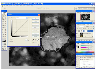
A second way to perform this "poping of the blacks and the whites" step is by using a curves adjustment layer. Imagine if you will, that you did not perform the above "levels" procedure, but instead opted to do it this way, using a curves adjustment layer instead. With the new black and white layer highlit, and not the background layer, simply click on the half white half black circle in the layers pallet well. Choose "curves" from the adjustment layer pop up menu. A new layer will appear after you do this.
What you need to do next is to click on the black eye dropper in the new curves pop up, and then click on the part of your image that is supposed to be a true black. Repeat this with the white dropper, on the true white part of the image, and you can even repeat it with the medium grey dropper too, if you need to. Most of the time I do not use the medium grey dropper. Click "O.K.".
If the new resulting curves adjustment layer is too harsh looking, or intense, you can tone it down by simply adjusting the opacity slider in the layers pallet well. Click on the number, or the percentage showing in number form, and slide it to the left.
Once you are done, it is time to "merge down" the new (curves or levels) adjustment layer. What you need to do here is click on the "Layer" heading, and then choose "merge down". You should see that your newly adjusted (curves or levels) layer has been merged down and combined into the second layer.
Next, it is time to create a layer mask. With the top layer high lit, simply click on the "add a layer mask icon" which is the brown square with the white circle inside of it, in the layers pallet well. This makes the active, or high lit layer a layer mask.
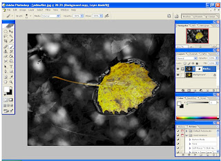
Pressing down "D" and then "X" (at anytime in Photoshop) will set the working colors to black and white. This should be done now, as it will be the only two colors that you will use with layer masks.
Click on the paint brush tool icon in order to get ready to paint. You can change the type and size of the brush as well as the intensity, or the opacity of the actual painting. With layer masks, as you paint with black selected as your active color the "active" layer disappears. To replace it, paint over it with the color white. So, if you make a mistake as you paint in black, no sweat! Choose white and go over it again to get it the way that it was. The higher you set the opacity of the brush itself, the more color it will alow to come through.
When you are happy with the results, go under the "layer" heading and choose "Flatten image". This will merge all of the layers into one "background layer. You are done!
You have just used levels, layer masks, and a curves adjustment layer all in one edit job. If you have never used any of these tools or tasks, take a bow! These tasks are not too hard to perform, but way too many folks are scared to use them, or even learn about them! Practice will bring speed, and a faster workflow.
One thing about Photoshop that I love is that you can perform any one task, in more than one way. Try out the many different tools, and see what things really do. You paid for the software, so use it!


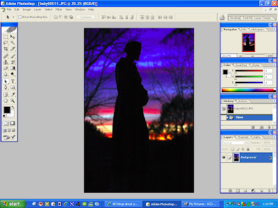
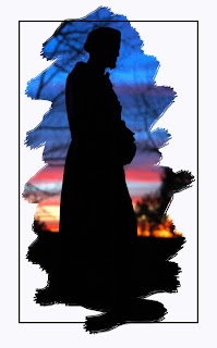 Here is a rather fast way to achieve this effect, and how to apply it to any of your images. Here is the image that I started with. It is of a statue at almost sunset, causing a pleasing silhouette.
 I am going to use white as a "fill color" to later erase from, in order to reveal the background image. However, you can choose any color you wish, and add effects to it like a gradient. You can choose an exact color using the eye dropper tool and you can even sample a specific color from your image using this same tool. In this example I will use a solid white.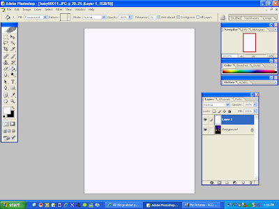
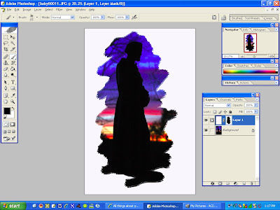 Next, I went ahead and added another new layer and chose the square select tool, and put a rectangle around the frame of the image. I then looked under "edit" and selected "stroke". Using a black stroke, I set the width to about 7, and chose "center", all in the stroke tool dialogue box. You can next alter the opacity of the stroke to taste while that layer is active. After you have played with it, and you like the way that it looks, flatten the layers. You can do this by looking under the "layers" heading, and choosing "flatten image". Last of all be sure to save your new creation, and use a thoughtful name!
 A relative and myself were members of a local camera club when a call for volunteers was put out one night. Basically, a non profit organization named the

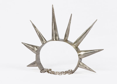 For the merchandise shots, I asked a friend that is honing her own hand-made jewelry marketing skills if she would like some images for her portfolio. Turns out that she was in need of someone with a decent photography studio to photograph some of her newer pieces. I could not have asked for a better line up!
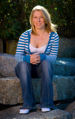 I met a local high school model thru a modeling website. I ran the idea of a free shoot by her, and she too agreed. I later found out that she had not yet had her senior photos taken. This was really coming together, and people were truly getting what they needed! With my feet still tired from the first two photo sessions, we decided to meet that very next weekend!

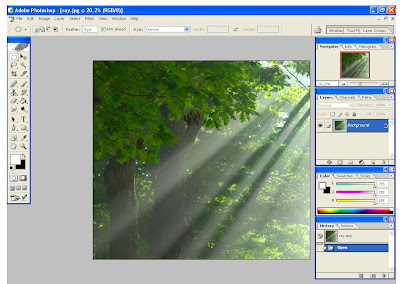
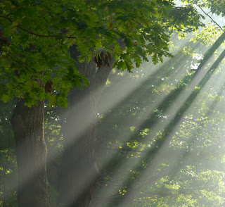 Let's assume that I have finished all work on the image. Vignettes should come last on the workflow list. Each vignette that I do I do separately. I like to make them as custom for each image as I can. Nothing is worse than a "loud" or obvious vingette, plus they are a fast thing to add to an image. With this image open in Photoshop, simply drag the background layer into the copy layer icon, and then you will have a copy of the original layer to work with.
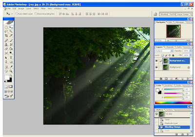
 In the layer pallet well, change the layer overlay style, or type, from normal to multiply. This type of overlay as well as "overlay" seem to work best most of the time for vignettes. Your image should turn dark, so stay with me as we will make it look good, I promise!
 Next, select the elliptical marquee tool, which is in the upper right hand corner of the tools well. A quick note about this tool: If you press and hold down the shift key as you use the elliptical marquee tool you will get perfect circles. If you use just the tool you will get ovals. I used the oval option, or without the shift key, for this particular image.
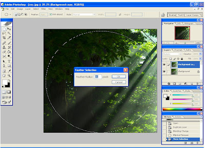 The very next thing for you to do is to press the "Delete" key on your computers keypad. This erases the center of our multiply overlay, leaving the edges alone, or leaving only the information outside of our feather.
 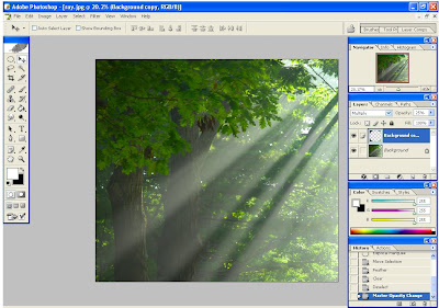 Adjust the opacity of the multiply/feather vignette layer to taste. I usually aim for about 20 percent. Lastly, you can look under the "layer" heading, and choose "flatten image", and save it as a JPEG.